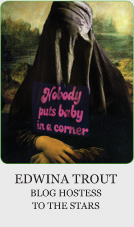
 Love her or hate her, Edwina Trout’s intrepid MonKeyArtAwards.com is one of the most widely read and hotly discussed websites amongst art directors and entertainment marketing executives. Its myriad discussions relating to entertainment advertising is unflinching, comical and often brutally honest. The site’s mantra “Poo will be flung” sets the appropriate tone for engrossing discussions ranging from thought provoking insights to polemic train wrecks that refuse to end. What sometimes gets lost amongst the entertaining insults and frenetic repartee is Edwina herself. Sporting a name that would inspire the Coen Brothers, she reigns as high priestess over MonKeyArt denizens, wielding astute perceptions and presenting examples of the sometimes-meager efforts that spring from the microcosm we call our creative community – and truth be told, some of my work has been fodder for her incisive chops. That aside, her sublime banter and unwillingness to compromise her convictions shows that nobody puts baby in a corner.
 Darryl – For those who don’t know, and I’m sure that number is rather small in the entertainment community – tell us about MonKeyArt Awards?
Edwina – MonKeyArtAwards is a website dedicated to Celebrating Achievement in the Entertainment Advertising Arts and Sciences. The “arts” part is what we in the trade refer to as concepts – and everyone else we know calls stealing – while the “sciences” part is all that bleed, trim and live area stuff.
D – What are some of the patterns or criteria you use in determining what you post on your site?
E – MonKeyArtAwards has an extremely narrow focus. It speaks to, and sometimes on behalf of, art directors, copywriters, finishers, and AEs (Account Executives) in print and outdoor entertainment advertising, so items need to fit within those confines.
The Monkey See, Monkey Do category seems to generate the greatest number of readers’ submissions. It strikes us more as a trivia game than any real comment on the lack of originality – after all, they keep making the same movies over and over, don’t they?
D – With respect to entertainment advertising – what are some of the things that personally bug?
E – If we’re talking about how the gears turn, it would have to be the arrogance and condescension on the part of some clients – especially on the part of former colleagues that crossed over to the dark side and became clients.
 On the other hand, if we’re talking about the end product, it’s the cynical choices made by clients pandering to the lowest common denominator.
D– Do you ever feel that comments from Users get a little too mean or personal?
E – Yes. It’s still surprising how angry some people are. Not just mildly irked about this or that, but truly bitter and resentful of others in this business.
It’s unfortunate because comments from just one or two readers can skew the tone of MonKeyArtAwards. We’re here merely to poke fun at the puffed up self-importance of our insular community, not to provide a venue for personal vendettas.
There are no hard and fast rules in poo flinging, just a desire for enough bonhomie to keep the vitriol from eating a hole in the Internet.
D – Are there original ideas left to be had or are we at a point where we are resolved to creating fresh takes on preexisting campaigns?
E – “Everything has been thought of before, but the problem is to think of it again.” - Johann Wolfgang Von Goethe
D – Is it your impression that key art is stuck in a rut?
E – Hardly. It gets more interesting every year; especially with network and cable TV making all those big, juicy outdoor media buys that we love to see.
It’s human nature to undervalue the work being done in our own time. This could very well be the golden age of key art – or at least the silver age, according to last year’s Key Art judges – only we might not realize it for another 15 or 20 years.
Movie and television shows have never been at the vanguard of advertising trends in the way fashion and music has, but there is less inclination on the part of some of the studios to react to something new and different by beating it to death with a giant club.
D - Is the MPAA censorship or an appropriate practice to protect the kiddies?
 E – All too often we mistake civility for censorship. Artwork posted in public spaces has a societal obligation to behave in a polite manner. It’s an adolescent conceit that being obnoxious is the same as being intriguing.
D – Where do you go to find inspiration for your creations?
E – The Louvre, Museo del Prado, the Sistine Chapel, of course. And anyone who says they don’t go to IMP Awards for inspiration or reference or exhumation or whatever you people are calling it, is a mendacious, insecure blowhard and should not to be trusted with the office Oscar™ pool money.
D – I like DVD artwork and packaging, and it’s been disappointing to see that segment struggling. Do you think Home Entertainment is going down the same road Music went with iTunes? Is DVD artwork headed for extinction?
E – It’s hard to lament the passing of DVDs when you have movies streaming right into your PS3. Moreover, as a film lover, it’s depressing seeing movies displayed in racks at the supermarket alongside the Doritos and the Charmin.
There was a time when creating 12x12 album covers was the Holy Grail for art directors and illustrators. Before that it was probably Saturday Eve- ning Post covers or carnival sideshow posters. Something else will come along soon enough to ease the pain. We just pray it’s not more digiboards.
D – Are there any upcoming campaigns you’re looking forward to seeing this year?
E – I, Frankenstein. The Great Gatsby. Robopocalpse – or is it RoboCopalypse? The new Austin Powers movie. Pretty good guess what the Me and My Shadow one sheet will look like.
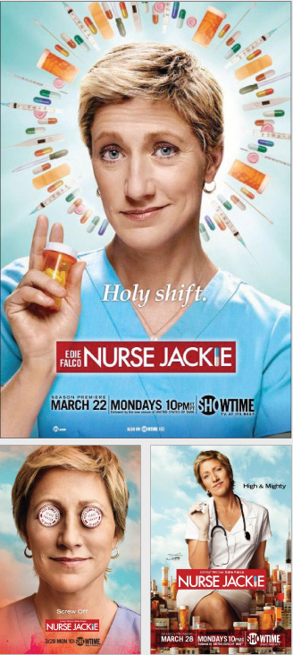
 Always look forward to the Nurse Jackie campaigns – Showtime makes some excellent choices, as does Focus Features and FX. And of course we’ll be looking forward to TNT’s next Dallas campaign, in the same way passing motorists look forward to rubbernecking a roadside disaster.
D – Let’s discuss some campaigns that you found inspiring. Tell me why you’re smitten with the artwork for Guarding Tess?
E – Do you believe in love at first sight? We could go on about the Guarding Tess poster’s Rockwellesque presentment of a meticulously staged narrative, but such highfaluting talk comes after the irreducible phenomenon of love at first sight.
D – Do you find that television key art requires a different aesthetic because it’s not on a big screen?
E – The main requirement effecting aesthetics is that clients have some sense of it.
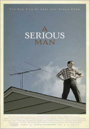
D – A Serious Man artwork was a bit of a surprise for me. What are the elements in play that put this on your “favorites” list?
E – Everything. We like everything about it. Or, how about nothing? As in there is nothing about it we don’t like. It boils down to like/don’t like. It’s a matter of personal taste, and the opinion of one person in a burqa is as valid as the next one’s.
Beyond that, it becomes an exercise in qualifying – that is, characterizing your choice by naming its attributes – and then you’re on the slippery slope to becoming a windbag, which we clearly demonstrated in our critique of Guarding Tess.
D – When you say we, are you talking about the voices in your head or is there a group of kindred spirits who share this view with you?
E – It’s a third-person, authoritative “we” that “we” stole from Miss Manners and “we” are certainly in no hurry to give it back.
D – (laughs) Okay, moving on. The Waiting For Superman artwork reminds me of some neighborhoods in Detroit. How sad is that? Share your thoughts on the strength of this artwork and why the elements come together so nicely.
E – It’s a very arresting image. Admirable lighting and composition.
However, once we discovered it was a documentary and NOT a movie about over-achieving children of the damned in a post apocalyptic zombie-infested world, we lost all interest.
D – Which raises an interesting question – does key art require fidelity to a film’s plot and format to be effective advertising?
E – If it draws us in for a closer look, then that certainly is a compelling ad. The print campaign should have the same tone and sensibility as the film, but not necessarily explicate the story line – after all, revealing the film’s entire plot is essentially the function of the trailer.
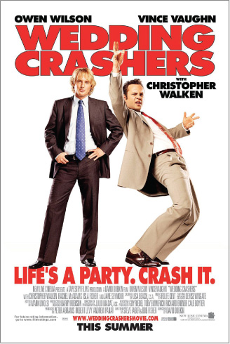
D – You think highly of Wedding Crashers. Boil it down for us.
E –The title did most of the heavy lifting on that one, so it was very smart to put it at the top of the one sheet. Great silhouette value, too. Very much like The Proposal, where the title and the body language told you at a glance what you’re in for.
Key art that concisely informs viewers like this can also serve as a public service announcement. For example, when we see Dane Cook featured prominently on a poster, we know instantly to avoid that movie.
D – Thank you Ms. Trout.