IMP Awards > Annual Awards > 2006 > Worst Teaser Nominees
2006 Internet Movie Poster Awards - Worst Teaser Nominees
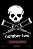 |
Nothing particularly wrong with this poster except that it is basically identical to the poster for the first movie. Surely there could have been some change made to the skull and cross crutches design to better signify a sequel. |
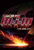 |
The striking match has always been an important part of the series openers so the idea of using it on the poster sounds great. But in this case it simply doesn't work. Perhaps it needed a different background or maybe it is simply that a single image can't properly capture the match being struck. Whatever the reason, the poster seems far too bland to promote an action packed film. |
 |
The posters for this film never seemed to really grab people's attention. In this case it seems to be especially too close up to the ship. We get no sense of the ship itself. Showing the entire ship would likely have been much more effective. Check out a poster for the original film to see a more kinetic design. |
 |
What's in a name? In the case of Rocky there is probably a fair bit. However, simply displaying the name of the movie in a teaser seems pretty lazy. NOTE: It has since come to our attention that this design was simply used for early promos and never actually made into a poster. Therefore, it is out of the running. |
 |
As many people have pointed out, the posters for this film lead to confusion over what the actual title of the movie was. In this case, one is likely to assume it is either "Go Home" or "Go Home Turistas". Meanwhile, the girl in the picture simply does not seem scared enough to make us realize this is a horror film. The second poster at least includes the shadow of a scalpel but based on this poster one might think it is a Christmas film about a student needing to go home for the holidays. |