2003 Internet Movie Poster Awards - Worst Blockbuster Nominees
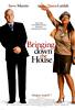
Bringing Down the House
I suppose the poster does show the contrast between the two characters,
but all I see is Steve Martin being himself and Queen Latifah being annoying.
At least the tag line is funny.
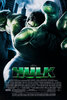
Hulk
A rather daring idea, to conceal most of Hulk behind his own green hand
as he reaches out to grab you. But it seems a little too obscure and claustrophobic.
We want to see more. (Of course maybe that was the whole point...)
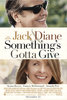
Something's Gotta Give
Okay, so we have a movie and it stars Jack and Diane. And Jack is wearing
sunglasses. And they both have very nice teeth. Given the plot of the film,
there could have been plenty of great poster ideas, but in this case, they
didn't even try.
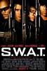
S.W.A.T.
Squeezing all of the characters' faces onto the poster wasn't enough, they
had to toss in all of their guns as well. The end result just looks like
a mess.
2 Fast 2 Furious
Another case where too many faces spoil the poster. Once again we have
a poster that seems to have been slapped together with each of the character
posters.